School Board Explores New Logo Designs
January 22, 2022
Various new logo designs were presented to the school board on Thursday, Jan. 20.
The board did not decide to embrace a new logo and remarked that they may not decide to embrace any new design, but did opt to keep the Warrior name tied to SYCSD.
Graphic communications teacher Wade Bowers and senior Danielle Williman presented each of the options and the process that the design team underwent.
Since April 15, 2021, the Warriors have been represented by their name alone as the school has worked to retire its former logo, the Native American mascot.
Bowers has been working with an innovative group of students to create a new design since this decision.

“We have to finally establish [a concept] that we can go to,” Bowers said. “It’s kind of difficult that we don’t really know what our identity is.”
The first of the two athletic design choices was a step towards embracing a new SYCSD identity and would bring about significant change.
“…the Southern Steam is a design that would link all three of the main towns together by featuring the steam engine as our logo,” Bowers said. “More importantly, the three towns that have such rich history with the train. This concept is a much greater change as the overall name would be changed from the Susquehannock Warriors to the Southern Steam.”
In a time of renovation and in the midst of a pandemic, a fresh start with this design would have many benefits.
“It was a concept that would be a terrific way to start from scratch and build a new brand that has more ties to our community than our current name,” Bowers said. “This brand would create excellent marketing and an exciting experience at games with the introduction of train whistles and steam at sporting events to name a few.”
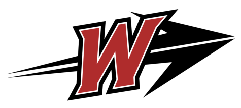
The second of the two athletic designs was based on the traditional arrow and the Warrior identity.
“The design is focused on the ‘W,’ with an arrow that is placed behind the ‘W’ or the ‘Warriors,’” Bowers said. “The arrow is actually created from the original ‘W,’ [and] the design is to showcase the words and descriptions that the marketing class discovered through their research, which were descriptions such as ‘bold,’ ‘strong,’ ‘sharp,’ ‘athletic’ and ‘memorable.’ The concept shows movement and a forward, upward direction that we want to take our teams and academics.”

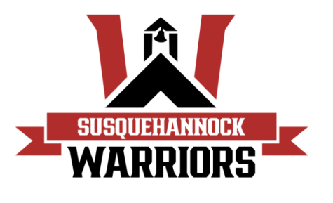
The final design of the academic working was a W, still representing the Warriors, with a schoolhouse incorporated into its structure.
The schoolhouse reflects another aspect of Susquehannock’s history with the original schoolhouse structure still standing at the entrance of the campus.
When speaking about the process, Bowers explained that the efforts of the marketing and design students have played a major role in identifying what the district should be represented by.
“My upper-level design students worked on this assignment, along with Mrs. McCullough’s marketing class in the beginning,” Bowers said. “As time went on, we did lose some students as they graduated and others as they went off to college. However, a lot of what those students had accomplished was to create a vast exploration in font, color and graphics that we could continue to explore as we started to build many concepts.”
All of the designs aimed to encompass what it means to be a Warrior, beginning with research by the marketing classes.
“The process all started once Mrs. Mccullough’s marketing class did research and interviews to discover what it meant to be a ‘Warrior,’” Bowers said. “Through their research, interviews, and all their collection of data, we began to look at what that all looks like visually. We took that information and began to create visuals that would portray that message.”
Bowers and his team had their hands full as the message was more difficult to condense into a single design than it seemed.
“…We explored color, font, and graphic elements that would best portray [our] message,” Bowers said. “Part of that message was ‘Be The Warrior.’ We felt that the font [needed to be] bold, sharp and strong. We felt that we needed consistency within the color so that everyone would always be using the same color palette. Finally, we started to look at what type of graphics would work with both names, Susquehannock and Warriors, to fit the findings.”

Bowers admits that the journey to selecting the final designs for consideration was extensive.
“It wasn’t a small task by any means,” Bowers said. “The overall process took over 3/4 of a year to complete. We explored hundreds, if not thousands of possibilities for logos. We needed to find a way to depict what it means to be a Warrior in our community.”
In the end, the team found success in their creations, but Bowers has high hopes pertaining to what the chosen design will achieve.
“My hope is that the [chosen] design will create a more modern, professional appearance,” Bowers said. “The design can be seen as a brand that our district creates [and can be] recognized as the Warrior brand…”